KL Divergence Explained Visually
Audience:
Analytics
Comments
The example given was a useful one here, and the visuals helped explain it nicely.
This was a very novel, fresh, intuitive, and well-motivated piece. For feedback, I would perhaps suggest including some significant real-world applications of this topic. You did a great job with the tomato explanation, but it would be easier for a general audience to better understand the motivation of this topic if you were to provide some other significant examples from the real world. On a technical level, there was an issue where one of the formulas wasn’t rendering correctly in the “The Formula” section. This might have just been something going wrong on my side, but please check just in case. Overall, this was really amazing - keep up the great job!
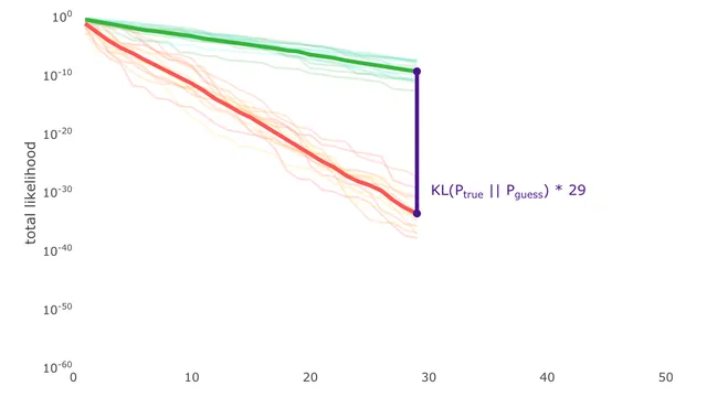
The way the comparison was made with the lines can be pretty helpful in class. Especially how the average lines emerged from multiple runs. This was really well done and there are many things that deserve to be praised. But since I’m short on time, I’d quickly get to some suggestions.
Ideally, it would be good if you start a video or explanation with those lines. To create a hook. Because kids are familiar with lines. It would be great if we could show a way to represent belief divergence. It would also be good, if you could show at the start some uses of KL divergence.
For example, show the lines and show how they change with different examples. Relatable examples of different beliefs. What do you think is the average height of a 5 month old baby? What is the height of mount everest? (something almost absolute)
Once people see the use of the lines, they’d wanna know more.
I clicked on this fast because I love KL divergence and it role in algorithmic entropy, Maxwell demon etc. But others may not. A hook matters.
Overall, Great work.
The visuals make it clear about how to measure the diff between how well two different distributions model a distribution, but naive question is Ptrue an idealized fairy tale? Do we ever actually know this empirically, I guess for some finite, static set of data??? Side note is I tried to drag the “slider” on the first image - user error :-) - and it messed up the graphics.
The animation is clear, but it lacks mathematical explanation. For example, why does “total likelihood” demonstrates the fitness of the distribution, and why does it have that formula? The KL Divergence was not clearly explained as well.
A unique and easy-to-understand approach to the topic Minor suggestions:
- mention the general definition of likelihood
- mention that we are calculating likelihood with probability densities, not probabilities
- use
\timesinstead ofxin scientific notation - there is nothing after “By the properties of log, this is equivalent to:”, maybe an equation is missing?
- in the expectation expressions , indicate that is drawn from ; you can write or
This was an engaging explanation of KL divergence. I liked the tomatoes example, I think it helped ground some of the ideas.
I could not see any of the formulas in the section ‘The Formula’. Perhaps that’s a bug? Could be something wonky with my browser, I don’t know.
Really concise and clear, enjoyable read overall.
I didn’t know about KL divergence before, and this was a good introduction to it. You made it seem almost self-evident. You’ve also anticipated my response when I reached the end (how is this made more rigorous? how does it apply to more pathological distributions?), so I’m looking forward to reading the second part.
I’d appreciate it if you could add some exercises at the end for us to test our understanding.
Also, I want to know more about the ideas of entropy and cross entropy you mentioned at the end, so some explanation of those and their names would be great, as well as textbook recommendations for this topic in general.
Some examples of why KL divergence is useful would make the article amazing.
The core idea is good and decently explained.
However, the text is very rough and needs more proofreading. The author confuses the probability with the probability density function, which is a very grave error. (See that if P(x=3.3) = 0.65, we can also choose P(x=4) ≈ 0.7, and they add up to more than 1, which is impossible).
In all of the diagrams it makes no sense to have the datapoints exactly within the curve, a histogram overlayed on it makes much more sense. Something like the first diagram here: https://louis.pressbooks.pub/finitemathematics/chapter/8-6-the-normal-distribution/