Quantifying Color
Audience:
Tags: colorscolor
Analytics
Comments
Perhaps there’s room for adding a little bit of story telling to make the content more engaging. By I like the depth of the post and the clarity of the explanations.
Nicely organized and nice visuals
The start of this post is extremely interesting and engaging. I felt like I learned a lot about light, how our eyes work, and how we quantify colors. However, by the time we got to chromaticity space, it felt like the post was dragging on a little bit. This doesn’t necessarily mean the post is too long or not interesting. I actually think the fix here would be better framing of WHY we are talking about these things. For example, we’ve already seen several ways to quantify colors, why are we talking about more? A useful guiding framework for this is to ask yourself, “What question am I answering right now”, followed by “Does the reader KNOW what question I am answering right now” and “Have I motivated this question for the reader/does the reader care about this question” (I think doing some of this even before the chromaticity space section would be helpful). Another option would have been to just make the post a little bit shorter to keep engagement/interest up all the way through, and have a follow up post for those interested in learning more.
Good introduction that demonstrates why measuring colour is useful and not as easy as it first seems. I also enjoyed the interactive visualizations and together with the clear technical descriptions, these are very good demonstration of how to understand colour blindness.
I think there are sections where you can have the main takeways highlighted as a separate box as the thing to remember. The details are good, and we can highlight what the main story builds towards to.
Overall, the article is slightly on the longer side with quite a lot of details. I think with narrowing the focus to just the first several sections, you would still get the point across. It might be worth just adding the other details as an appendix at the end.
Interesting and thorough treatise on how color is quantified. I’ve a desire to come back to this article and reference when thinking about color science. I learned a lot with the survey of color spaces presented in this article. From this lesson, I came to wonder what Pantone uses when they select each color of the year. Please expound on this current work more!
These individual scores contributed to your final Ranking score: Motivation: 9.8 Clarity: 9.9 Novelty: 5.75 Memorability: 9.7
Love all those little interactive elements, they’re fun to play with! This article is well researched and lays things out clearly. I could see myself using it as a resource for design work.
I learned more about color by reading this, but I’m not sure how good it’d be as a first introduction to what color is. Maybe it’d be just fine, idk
Also, you call the cones L, M, and S. I think that’s because they don’t correspond exactly to red, green, and blue, but it would be better if you said this explicitly in the article at the beginning.
I have to admit I started skimming the article somewhere after the section on Metamerism (and jumped to the sction on the controversial dress), so I noticed this, stopped for a while and came back to read it more carefully.
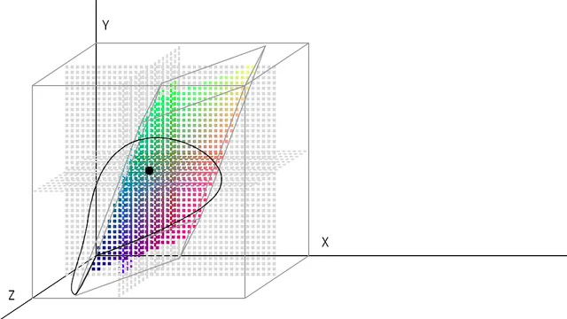
It would be nice if you went into a bit more detail about how luminance and chromaticity are really defined for the CIE XYZ space. You said they can be approximately calculated from the RGB values, but you don’t provide the exact definition. If it’s really technical, then it can go in a footnote.
The pictures of the classroom and dress somehow made things click more, or maybe it might have been because of the various images near the end being all on the same CIE xy chromaticity plane. The article and topic are actually really cool.
I never really clicked on the links embedded in the article, because it felt a bit jarring to do so. Hopefully they were useful for someone though.
Amazing interactive diagrams! Some parts of the article felt a bit tangential, and by the time the maths-heavy part came along, it felt a bit long-winded. But the layout was great.