Causation, Correlation, and Confounding: A Graphical Explainer
Audience:
Tags: statistics
Analytics
Comments
Not very mathy, but of course a dose of statistical understanding will not worsen the expected life outcomes for anybody!
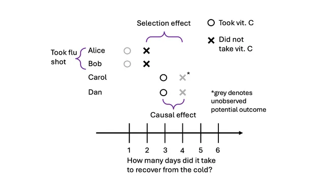
I enjoyed seeing a formal definition of causal effect. I am familiar with how hidden effects can cause confounding, but seeing a mathematical description was interesting.
The explanation was okay, and I expected to show more examples of this new graphic, didn’t seem very innovative.
Thanks for this paper and using Claude to generate the visualizations. The Ranking score is an average of these individual scores: Motivation: 9 Clarity: 5.75 Novelty: 7.5 Memorability: 5
Very nice buildup of the explanations. I personally would prefer more interactivity.
It was clear, and the visualisations for observations and potential outcomes helped my understanding of it a lot. I also enjoyed reading the historical studies that had these concepts.