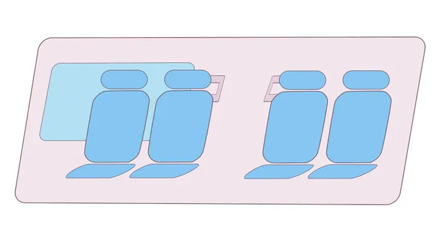
Broken Objects
Have you ever faced a challenging problem? Few things are more satisfying than discovering a simple solution to such complexities.
Analytics
Comments
6
I think some of the equations were not being rendered properly.
6.2
like the art
5
The idea and how it is made is good. Well done!
But unfortunately the latex-like text elements didnt load on my mobile firefox so it was hard deciphering them.
Please fix if possible!
7
I think this was an insightful article. Really great way to introduce group theory. I especially like the idea of adding interactive elements to the blog post to keep the user engaged.
4.3
Your definition of a group is incorrect; symmetry is not a requirement for a group, so in order to be accurate the article must note that it is referring to abelian groups.
6.5
Really fun presentation, thoroughly enjoyed your interactive scenarios!
5
Animations are good and language style is nice. But the topic and how it represented is not so interesting.
3.8
I find these examples of behavior of groups less clear than geometric examples like rotating and flipping a square.
3.3
Not so good a score for Motivation and Clarity, I'm afraid. I don't understand the 'broken train' metaphor at all. It's such a strange example that it was highly distracting even if the underlying maths is sound. You should have used an example of something that conceivably could malfunction in the way you need, such as, perhaps, a mis-wired fire alarm system in a large building, or debugging a teleporter network in a hypothetical computer game.
Also, what /was/ the underlying train behaviour? To conclude that 'the remote example works' and 'the train example doesn't', and then just stop, is also unsatisfying. Why doesn't it work, and importantly, is there a change to the train example that would have made it work, and is there some analytical way to tell other than trying every permutation? I ended with more questions than I started with, and that's bad, I'm afraid.
5.8
Nice interactivity!
1.7
This is rather confusing... these are good examples for automata theory, not for group theory. A system that has a finite number of states, and a finite number of "inputs" that cause the state to be changed, is called a deterministic finite automaton. So both cases are DFAs. To learn what DFA we are seeing, we should experimentally discover what all the transitions are.
And this is still assuming that we actually see what the full internal state is! It is not clear from your examples, maybe the button "5" actually does something, but it is not immediately visible as a state change. There are things like the Angluin learning algorithm which can be used to learn a DFA based on two kind of queries: entering a sequence of inputs (to an initial state) and seeing the output (only the output, not the full internal state), or claiming "ok, we know how this works, here it is" and either getting "yes, you are right" or a counterexample as a result.
In some cases the DFA transition function is actually a group operation (this would require a silent assumption that the set of inputs is the same as the set of states, which does not seem to be explained here...), but it is not clear why should we care. There are also interesting theorems connecting DFAs to algebra, mostly semigroups, but also groups.
3.4
Personally, I quite don't like the centering text. It's hard to read for multi-line paragraph.
The interactive aspect is nice. But I'm not aware that it's an interactive article the first time I read (I did skim through it, then re-read it again). Which make reading the whole article super weird. --- Maybe you should have a non-interactive version too? Otherwise maybe don't display any further text at all until the reader "play" with the remote control for some time?
Also, the flow of the article is not encouraging the interactive aspect that much. For example, the "History" section should be an empty table of size 10 empty rows right away to hints the reader that they can press remote's button to populate the data. And maybe the article should be 2-column style: put the remote on the left, the table data on the right. That's be more clear. (and also a personal nitpicking: the remote is ugly... the position of only 5 buttons feels weird. why not 10 standard buttons? why not just 4 buttons so it can be placed in a square shape? .... also that the TV should not change size vertically, so the remove stayed in the same place all the time.)
7.1
The article was executed well. I liked how it was interactive. The explanations also helped make groups intuitive.
While I understand the article is expository in nature, I would have liked to see concepts like abelian groups/isomorphism/symmetry groups that were alluded to mentioned in actual footnotes to direct the interested reader towards them.
