Interactive introduction to prediction
Audience:
Tags: machine-learninginteractivemlprediction
Analytics
Comments
I like the interactiveness
I would say the writing could be condensed. The interactive visuals are great, sometimes the explanations felt a little convoluted if entertaining. Not too bad stuff.
this blogpost would really benefit from having some images instead of a big body of text. it’s not memorable as-is.
Interesting and relevant topic with very nice graphics. Story element was fun and explanations were good.
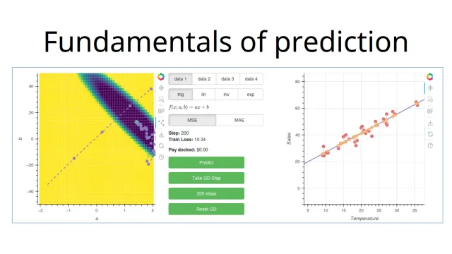
The introduction of the problem could be better to rephrase to something more intuitive rather than total sales and temperature and having 4 datasets is slightly confusing. What do these 4 datasets mean here?
Interactive elements are pretty good and the explanations are good, and I think with a better overall story of the problem around it, this can help to rephrase why the object of prediction is important. For example, why is it not a good idea to make it overfit, because one could be tempted to do that because we are still losing money overall. Connecting the idea of optimization is also not that obvious why it’s clear we can’t just choose a parameter correctly the first time around to the lowest loss here.
I like the whimsical theme, and maybe we can refine it to be still be whimsical, but still tied to something we can visualize in real life.
The interactive diagrams were so good!
- Really humorous, full rating for that
- Really great way of bringing in the concepts
- Enjoyed going through the whole blog